A carousel interaction pattern looks like this:
Basically it’s a layout pattern where one starts out positioning content in vertical blocks. Some of those blocks are going to have content arranged in horizontal blocks.
So far so good. You might think this will result in a layout that roughly looks like this:
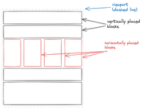
This is a pretty common block structured layout. So common in fact that most block structured layouts will flip orientation by nesting level. If you nest a layout block inside a block that has vertical layout then the inner block will automatically switch to doing horizontal layout.
Notice that the entire layout fits snugly within the viewport.
Layout Runneth Over
Interesting stuff happen when the layout doesn’t fit inside the viewport. When it doesn’t fit vertically, obviously you’ll have to scroll up and down to see the whole thing.
However, if only the horizontal block doesn’t fit, that’s when the carousel pattern kicks in. So now things start looking like this:
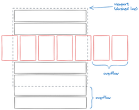
How do you construct a UI affordance that lets people pan around this? Of course you use … wait I already mentioned it .. pan. Maybe use scroll bars or just about any other scrolling affordance.
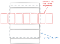
So would it look like this if you scroll both horizontally and vertically a little bit?
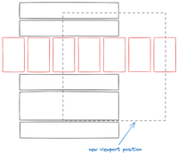
Sliiiiiide To The Right
To address all the blankness, the carousel pattern posits that the the overflowing horizontal bits should be moved around independently of the vertical bits. Like this:
We once again have the problem of affordances. There are many ways of doing this. Most devices have some way of panning around both horizontally and vertically. So the solution is obvious. Right?
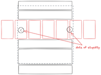
If people stop here and implement that, then that would’ve been over.
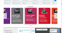
Uh oh. Here come the dots of stupidity…
Instead, they went with this:
Let me summarize this interaction pattern.
- Use scroll bars, or whatever scrolling afforance to scroll up and down to access bits that are above and below the viewport.
- Click/tap on little circles with arrows to access bits that are on either side of the viewport but only within the single sliding carousel block containing the arrows.
There’s a couple of problems with this:
- The obvious wonkiness of having two different methods of scrolling horizontally and vertically.
- Too easy to tap on the underlying “tile” instead of the dot-of-stupidity.
Carousel sympathizers explain the reasoning for this as follows:
-
What if there was more than one horizontally sliding thingies? How would one know which horizontally sliding thingy to apply the horizontal scroll operation to?
This is a purely hypothetical problem that often doesn’t exist. But I understand that UX designers have to account for the possibility.
-
It’s okay because the user doesn’t always need to or want to see everything in the carousal. Why bother them with details they don’t need?
That’s nice, but how would the user know they don’t need to see the thing without seeing the thing? It might be possible if all the visible things in the carousel were irrelevant to the user then they’ll just ignore the whole carousel.
But what about the very users who are interested? They need to jump through hoops to look at the things that are relevant.
-
What if there’s sooo many things in the horizontal slidey bit that we can’t possibly accommodate all of it?
Someone has to click on the little dot with the arrow enough times to see each one incrementally. The number of items for which such a UI works is far smaller than a UI where one scrolls past them using a much more ergonomic interface.
What’s Better?
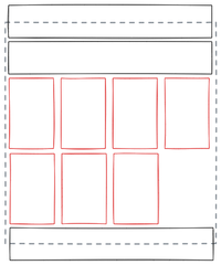
Try wrapping the horizontal blocks so the page only overflows vertically.
If there’s too many things to fit in a vertical overflow layout, then there’s already too many things for anyone to click through individual cards to see.
Just show the user a good subsample. If it whets their appetite, then offer them a link to take them to a dedicated page.
In Summary
- Don’t use carousels in your UI.
- Instead, if you must stick content into little cards, let the horionztal layout wrap to additional lines.
- If you end up with too many horizontal lines of content, then you definitely have too many items that can be accessed via a horizontally panning UI. You need a different UI altogether.